

勉強用のメモ書き
参考URL:https://obgynai.com/matplotlib
参考URL:https://aiacademy.jp/media/?p=154
matplotlib の動作環境を整える
Google colabを利用しない場合
pip install matplotlib
pip install numpy
matplotlib と numpy をインストール
Google colabを利用する場合
matplotlib と numpy 初期から利用可能
各種グラフの作り方
①matplotlib.pyplotをインポート
②x軸の配列を作る
③y軸の配列を作る
④plot関数でプロット
⑤show関数でプロットしたグラフを描画する
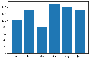
棒グラフ(縦)
import matplotlib.pyplot as plt

x_values = ['Jan', 'Feb', 'Mar', 'Apr', 'May', 'June']
y_values = [100, 130, 80, 150, 140, 130]

plt.bar(x_values, y_values)
plt.plot()

plt.show()
実行結果
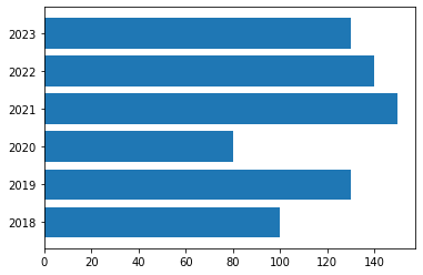
棒グラフ(横)
import matplotlib.pyplot as plt

x_values = ['2018', '2019', '2020', '2021', '2022', '2023']
y_values = [100, 130, 80, 150, 140, 130]

plt.barh(x_values, y_values)
plt.plot()

plt.show()
実行結果
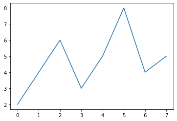
折れ線グラフ
import matplotlib.pyplot as plt
data = [2, 4, 6, 3, 5, 8, 4, 5]
plt.plot(data)
plt.show()
実行結果
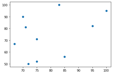
散布図
NumPy ライブラリを利用

NumPy入門 | AI Academy
1. NumPyとは何か、また何ができるのかを学ぶ。 2. NumPyでよく使うメソッドを学ぶ。 3. 行列に関して簡単に学ぶ。
aiacademy.jp
import matplotlib.pyplot as plt
import numpy as np

noodle = np.array([70, 95, 83, 100, 72, 71, 75, 85, 67, 75])
banana = np.array([90, 82, 100, 95, 50, 81, 52, 56, 67, 71])

plt.scatter(noodle, banana)
実行結果
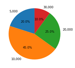
円グラフ
文字コードの兼ね合いがありそうなので要検証
import matplotlib.pyplot as plt
import numpy as np

cause_of_death = np.array(["5,000", "10,000", "20,000", "30,000"])
percent = np.array([20, 45, 25, 10])

# 桁数(%.1f%% 小数第一)
# グラフは反時計回りに生成される
# startangle = 90で12時から反時計回り
plt.pie(percent, labels = cause_of_death, autopct = "%.1f%%", startangle = 90)
実行結果
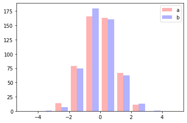
ヒストグラム
便利そうだが今時点で利用シーンは要検討

ヒストグラムとは?ヒストグラムの書き方(作り方)や分布図の見方を徹底解説 | Backlogブログ
度数分布を表すグラフとして利用されるヒストグラムは、数字で表された分布表を図に変換して分かりやすくするツールです。ヒストグラムを使うと、プレゼンや会議などで資料の内容を相手に伝えやすくなり、自身の理解力も助けます。ヒストグラムの書き方や見方、よく混同される棒グラフとの違いなどを解説していきます。
backlog.com
import matplotlib.pyplot as plt
import numpy as np

a = np.random.randn(500) #サンプルなので乱数をセット
b = np.random.randn(500) #サンプルなので乱数をセット
param = {'x': [a, b],
         'range': (-5, 5), #x軸の範囲
         'bins': 10, #ピン数
         'color': ['red', 'blue'], #色
         'alpha':0.3,#透明度,
         'label': ['a', 'b'], #凡例
         'stacked': False #積み上げ棒にするかどうか
          }
plt.hist(**param)
plt.legend()
実行結果
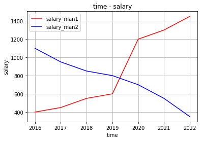
複数グラフの作り方
グラフを重ねて表示
import matplotlib.pyplot as plt
import numpy as np

x1 = np.array([2016, 2017, 2018, 2019, 2020, 2021, 2022])
y1 = np.array([400, 450, 550, 600, 1200, 1300, 1450])

x2 = np.array([2016, 2017, 2018, 2019, 2020, 2021, 2022])
y2 = np.array([1100, 950, 850, 800, 700, 550, 350])


plt.title("time - salary")
plt.xlabel("time")
plt.ylabel("salary")
plt.grid(True)

plt.plot(x1, y1, color="red", label = "salary_man1")
plt.plot(x2, y2, color="blue", label = "salary_man2")
plt.legend(loc = "upper left")
実行結果
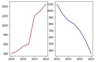
複数グラフを並べて表示
import matplotlib.pyplot as plt
import numpy as np

x1 = np.array([2016, 2017, 2018, 2019, 2020, 2021, 2022])
y1 = np.array([400, 450, 550, 600, 1200, 1300, 1450])

x2 = np.array([2016, 2017, 2018, 2019, 2020, 2021, 2022])
y2 = np.array([1100, 950, 850, 800, 700, 550, 350])

fig = plt.figure()

sp1 = fig.add_subplot(1, 2, 1)
sp1.plot(x1, y1, color="red", label = "salary_man1")


sp2 = fig.add_subplot(1, 2, 2)
sp2.plot(x2, y2, color="blue", label = "salary_man2")
実行結果
グラフを画像として保存
Google colab ではDLまで行けなかったので要検証
import matplotlib.pyplot as plt
import numpy as np

time = np.array([2010, 2011, 2012, 2013, 2014, 2015, 2016, 2017])
salary = np.array([300, 400, 450, 550, 600, 1200, 1300, 1450])

fig = plt.figure()
plt.bar(time, salary)
fig.savefig('graph.png')